Helping customers make better financial decisions
Product Design Lead · Oct 2024 – Mar 2025
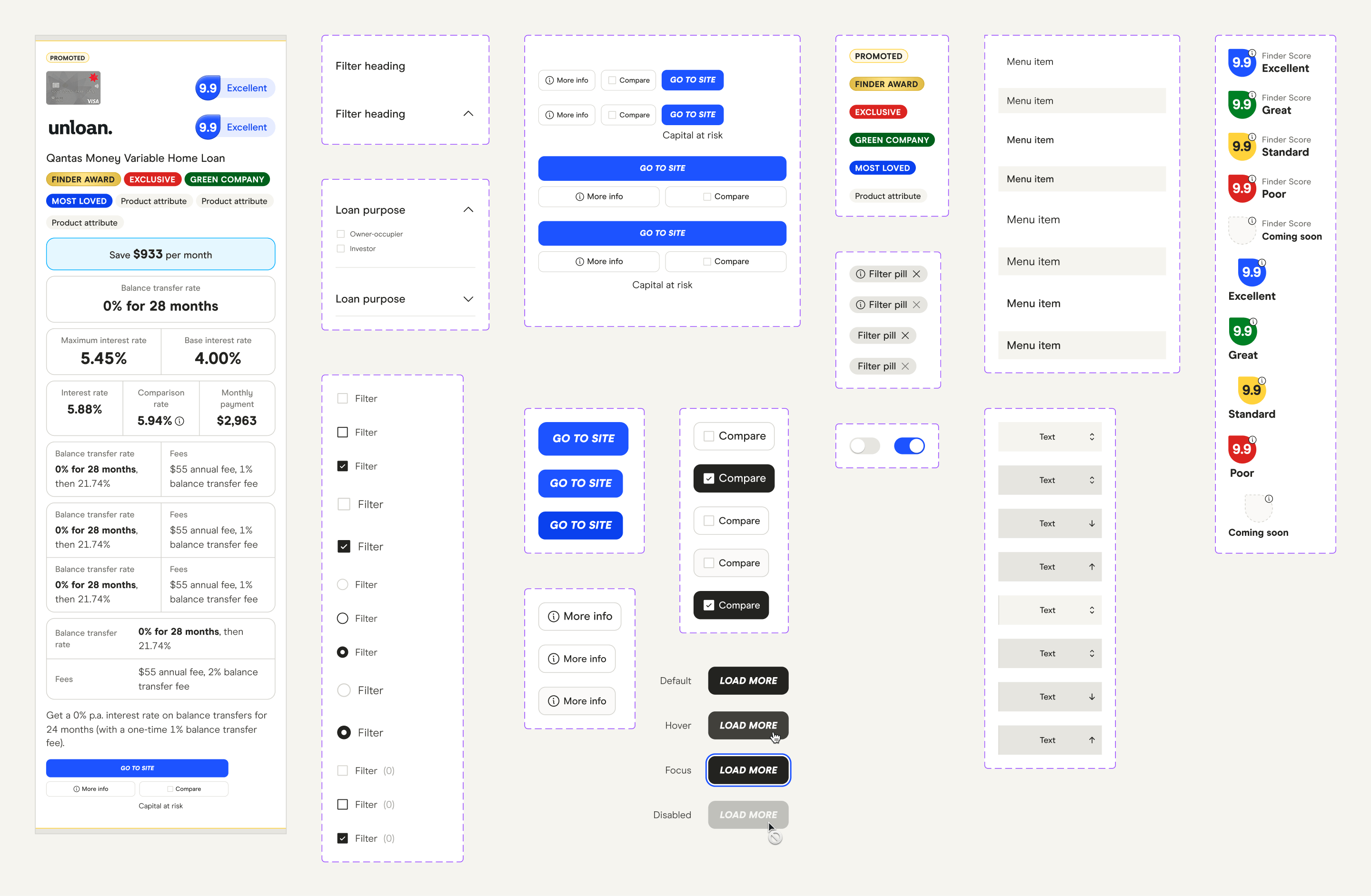
How I crafted Finder's comparison tables that improved user experience, scalability and increased conversion by up to 26%.
Context
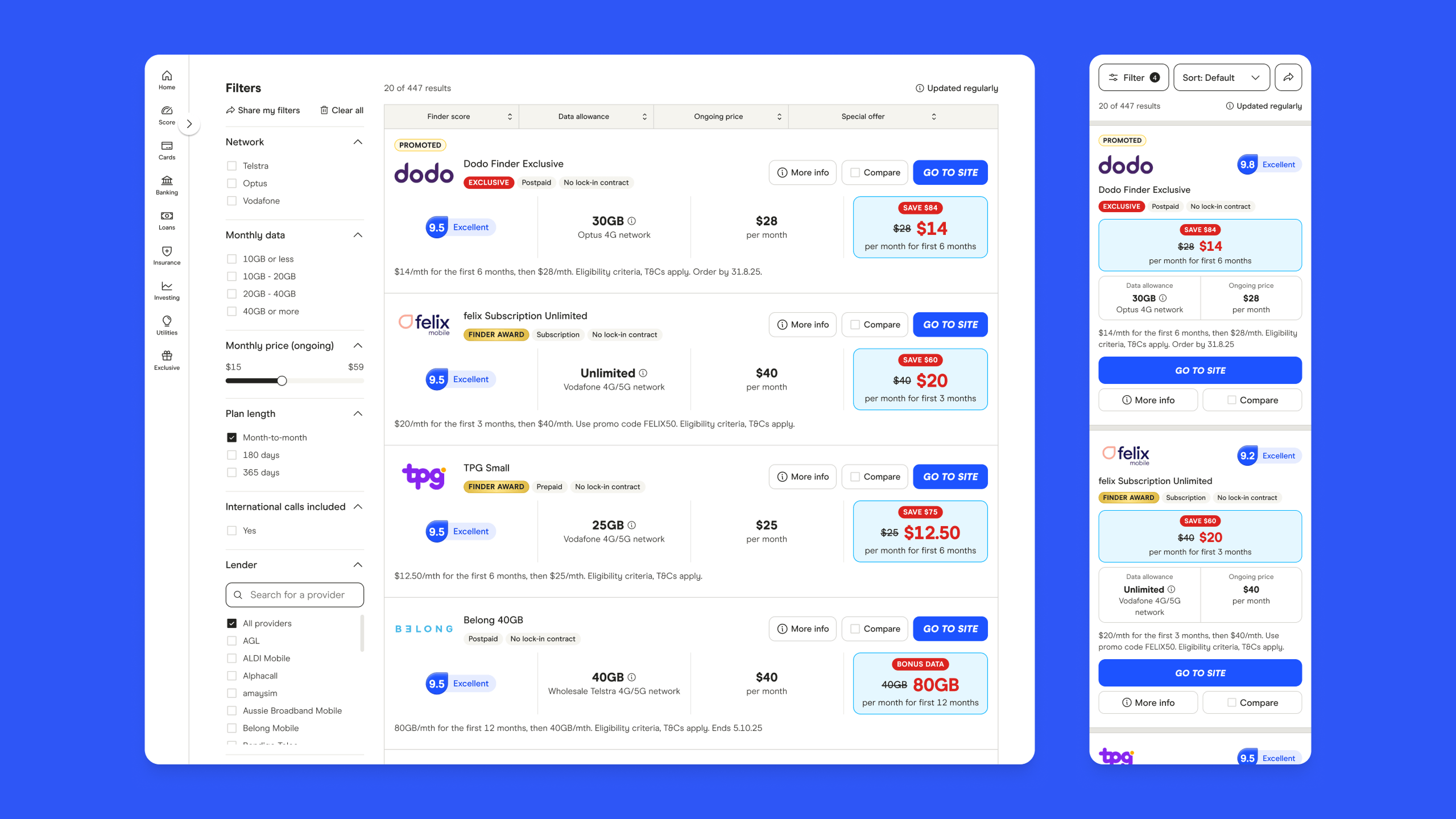
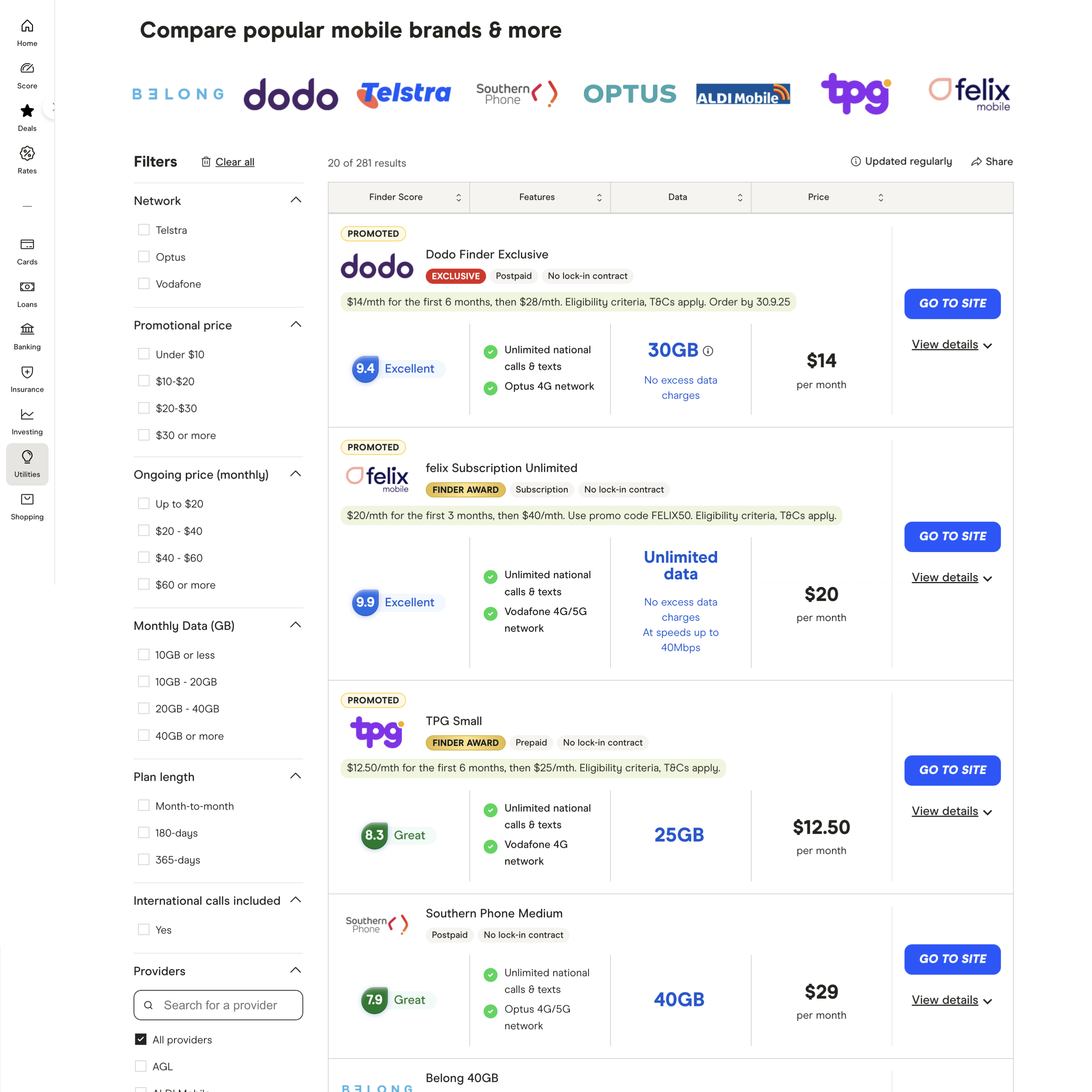
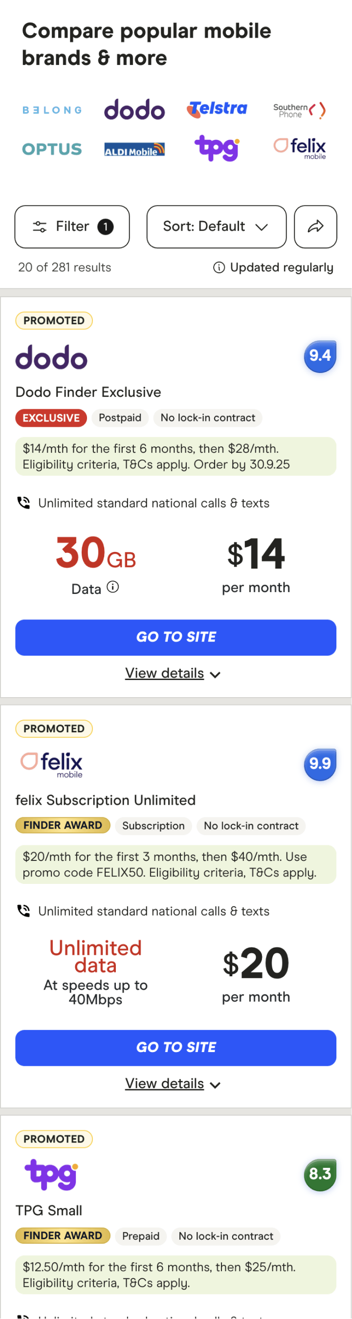
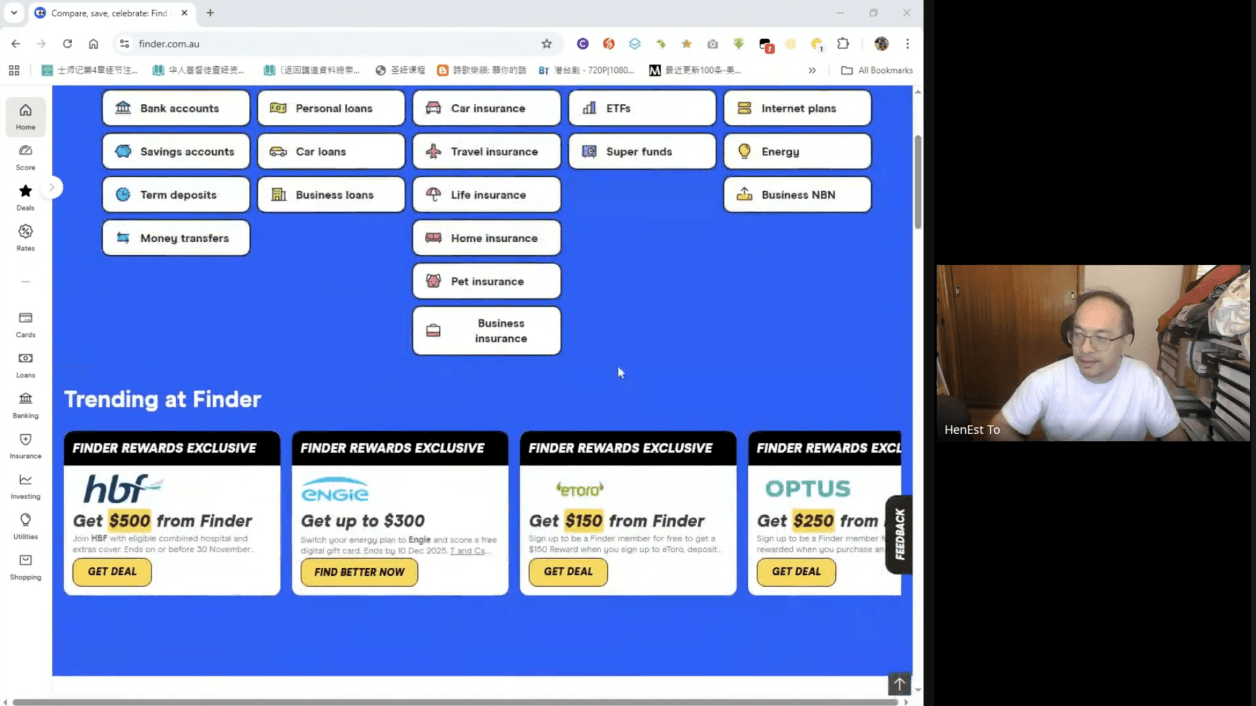
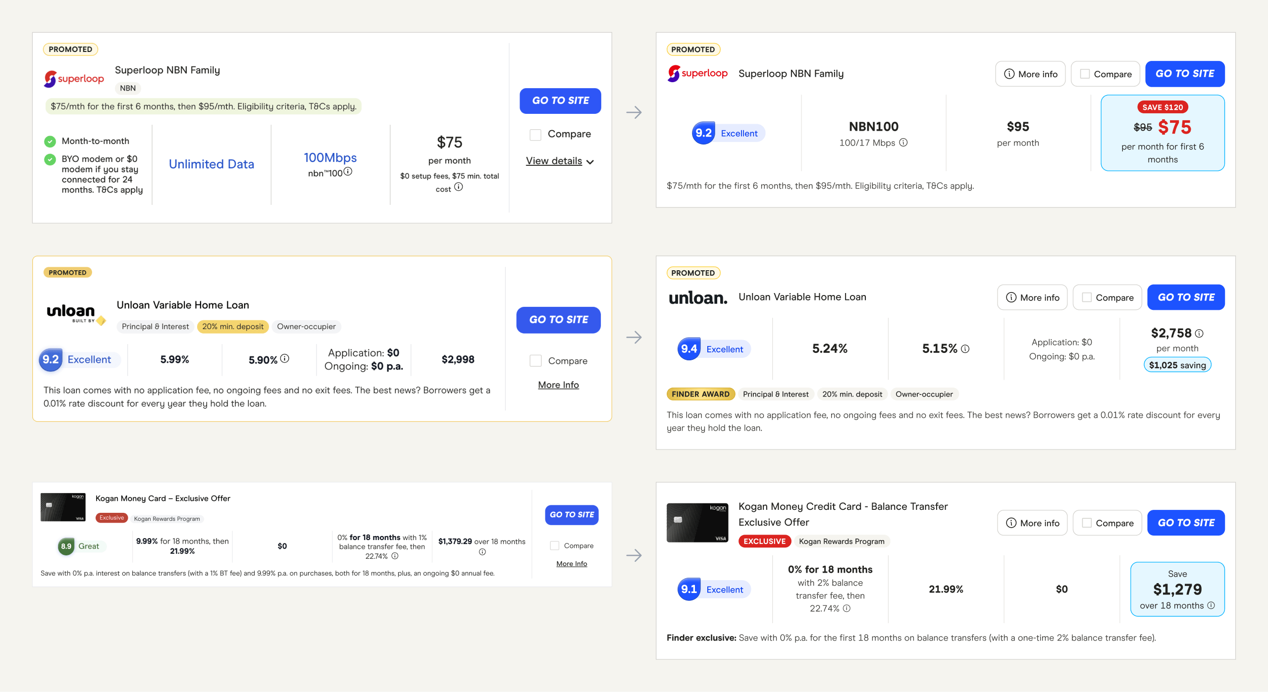
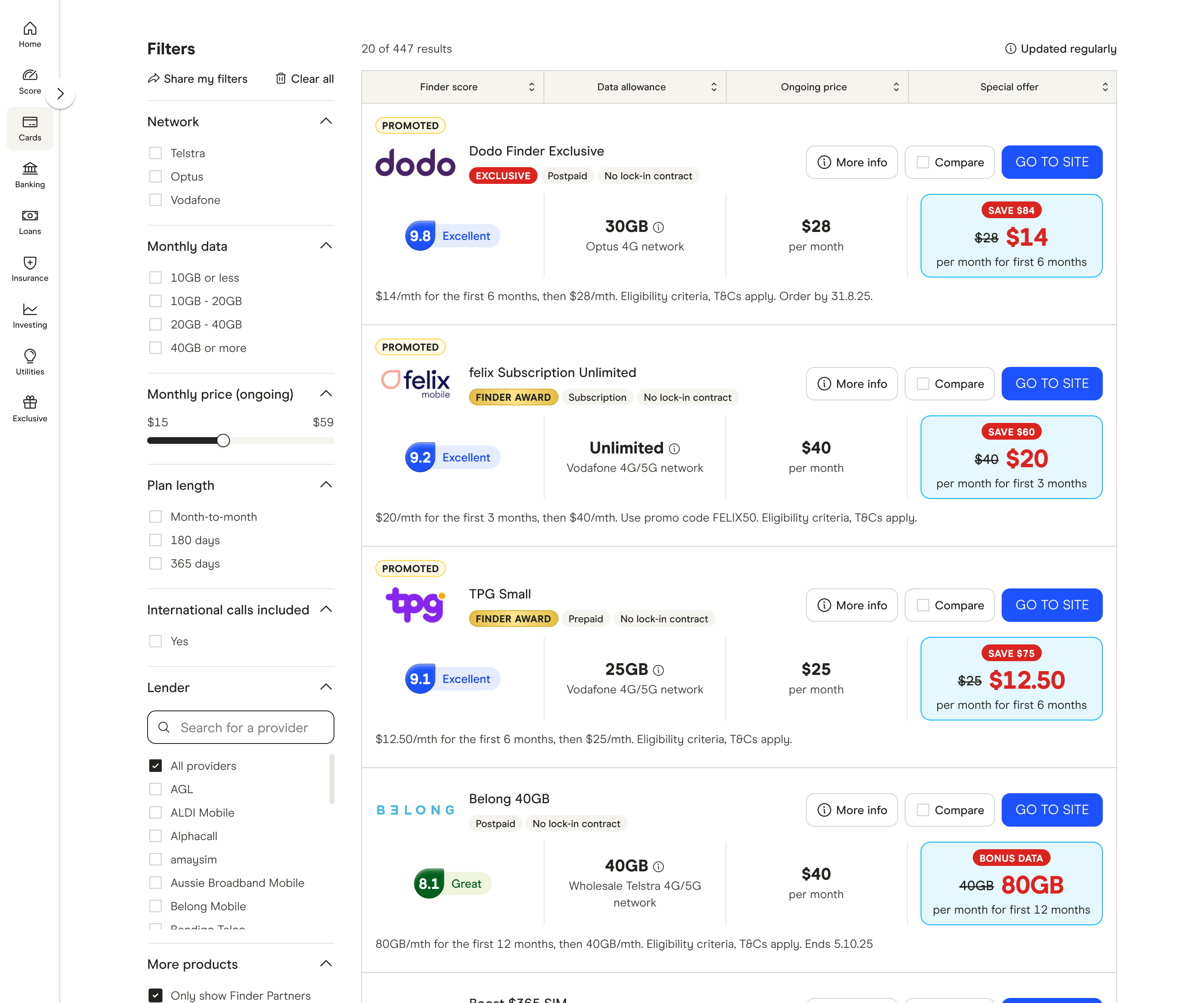
Finder's website is built around comparison tables used by over 2 million monthly users to compare over 50 financial and insurance products like credit cards, home loans, mobile plans and health insurance. They're what keep the lights on - so any change in conversion or SEO has a real impact. The current tables were a patchwork of past experiments which had caused widespread inconsistencies and a fragmented user experience.
"I didn't realise the cheap price was only for a few months! VERY MISLEADING!! Make that clearer before people sign up!!"
– Real complaint from website feedback
The task
I was tasked with improving the engagement rate and conversion rate of one category by ~10%. I also set myself a stretch goal of making improvements that could be systemised and rolled out site-wide.
Goals
- Improve success metrics
- Improve consistency
- Improve accessibility
- Create a single source of truth
- Create a flexible and scalable interface
Success metrics
- Conversion rate
- Earnings per view
- Engagement rate
- Bounce rate
- SEO impact
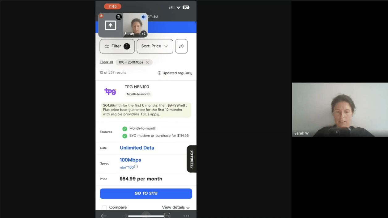
Customer interviews
I started by speaking to our customers to learn about their pain points and what would help them find a product that suits their needs. The below is an example of testing our mobile and internet plan categories.
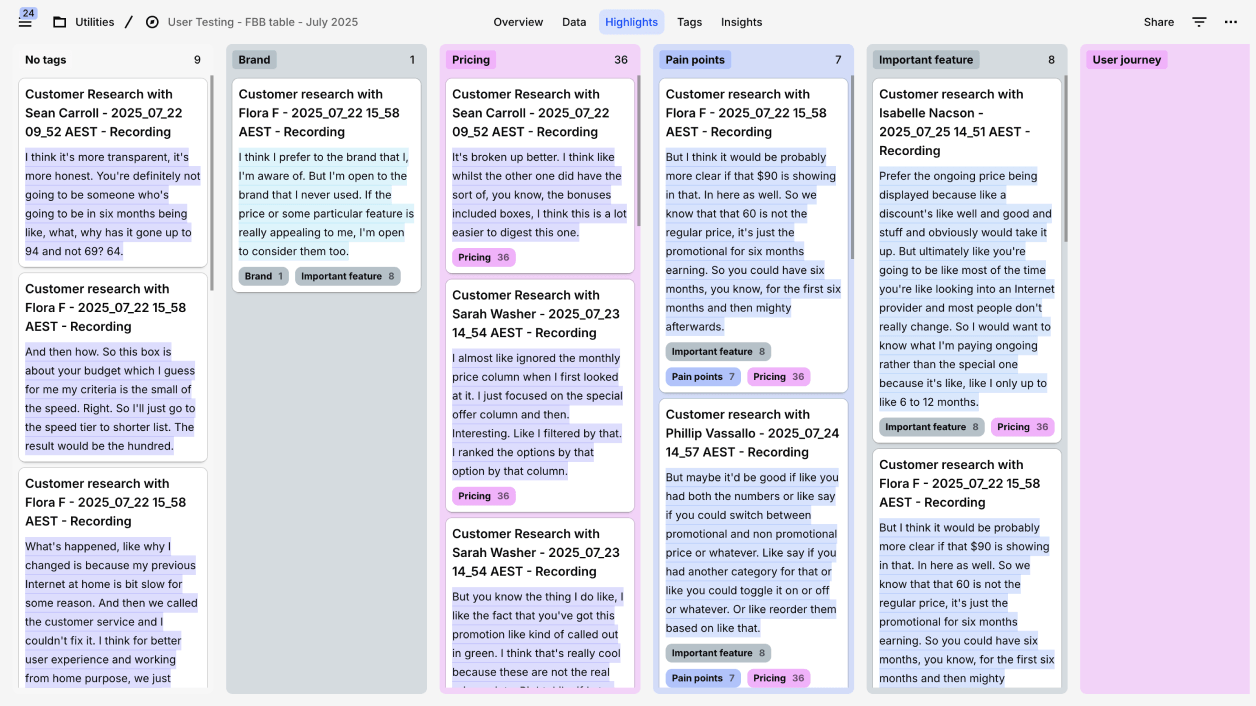
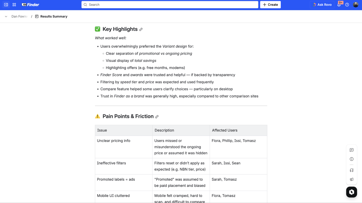
Insights

What worked well
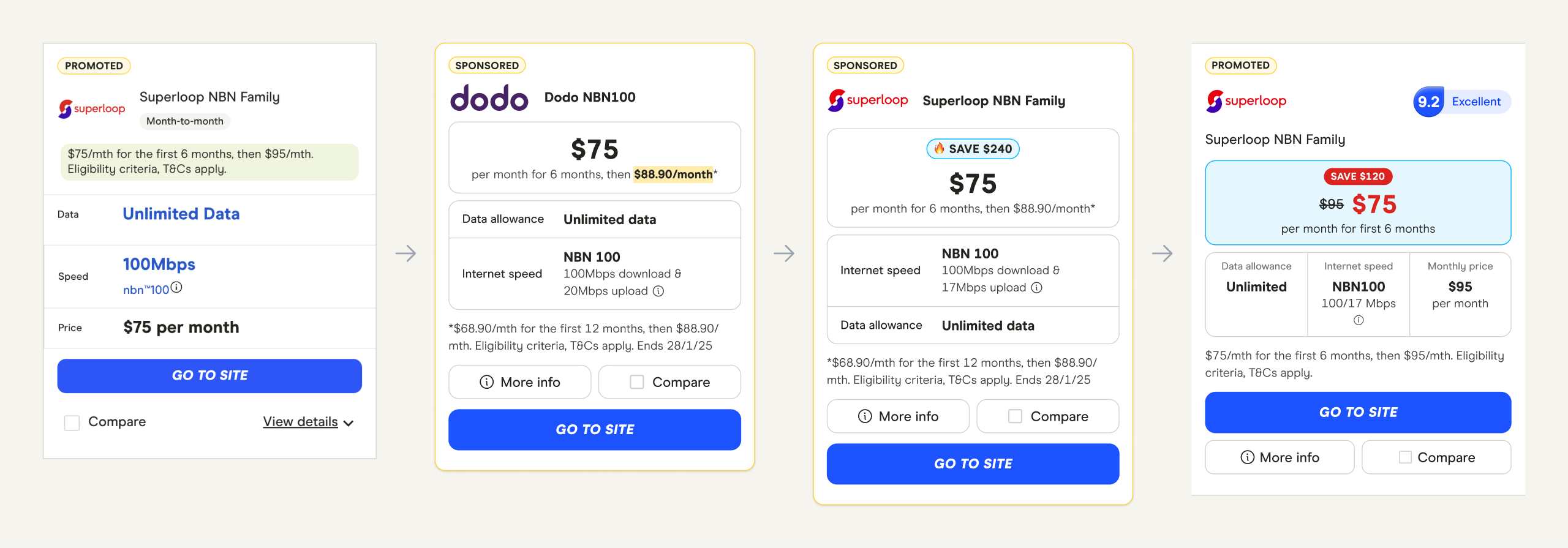
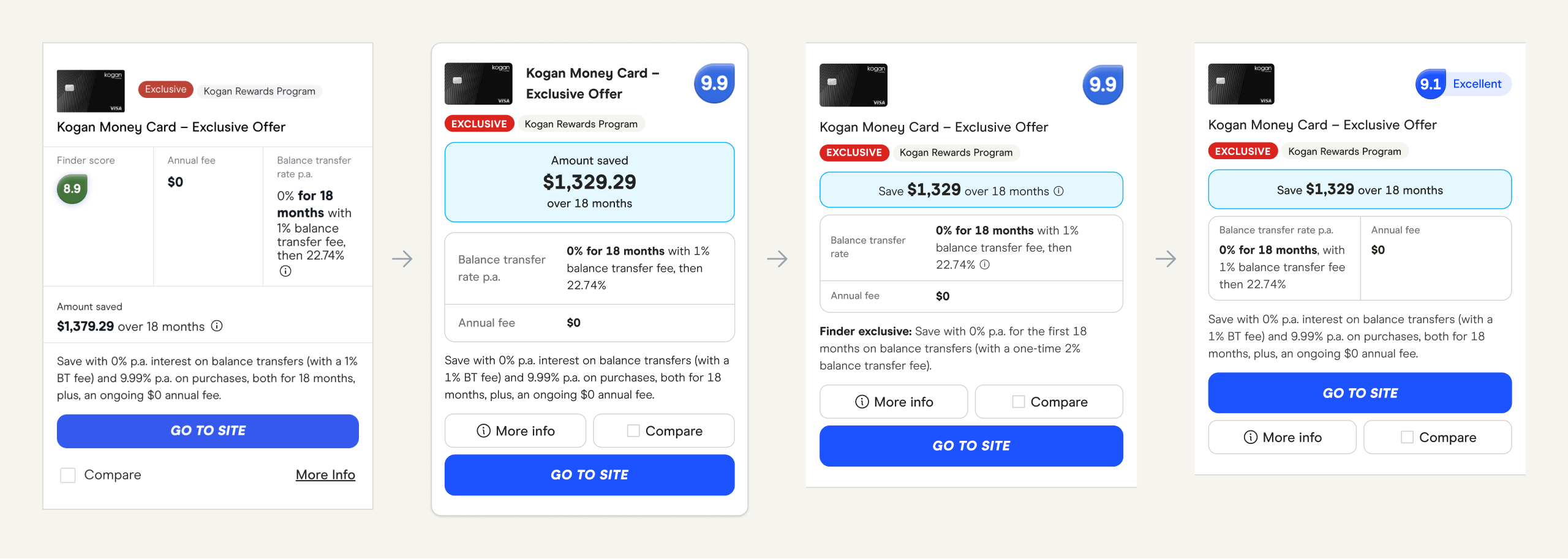
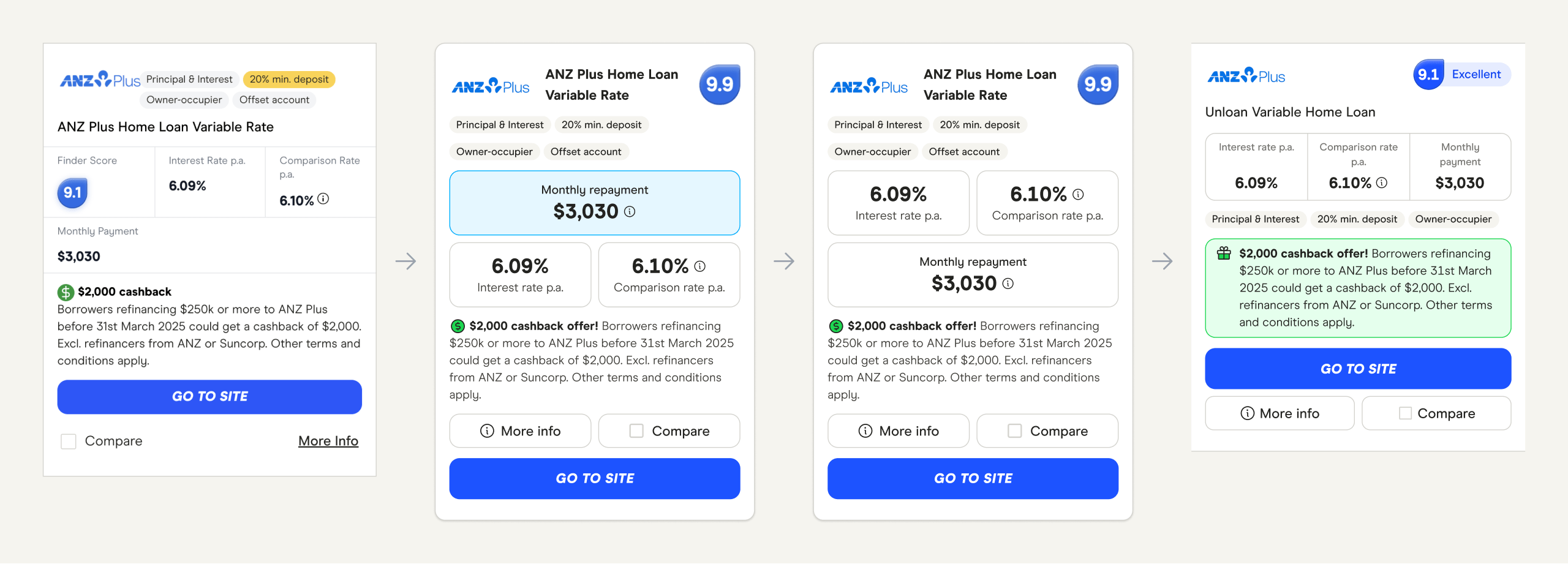
- Clear separation of promotional vs ongoing pricing
- Visual display of total savings
- Highlighting offers (e.g. free months, modems)
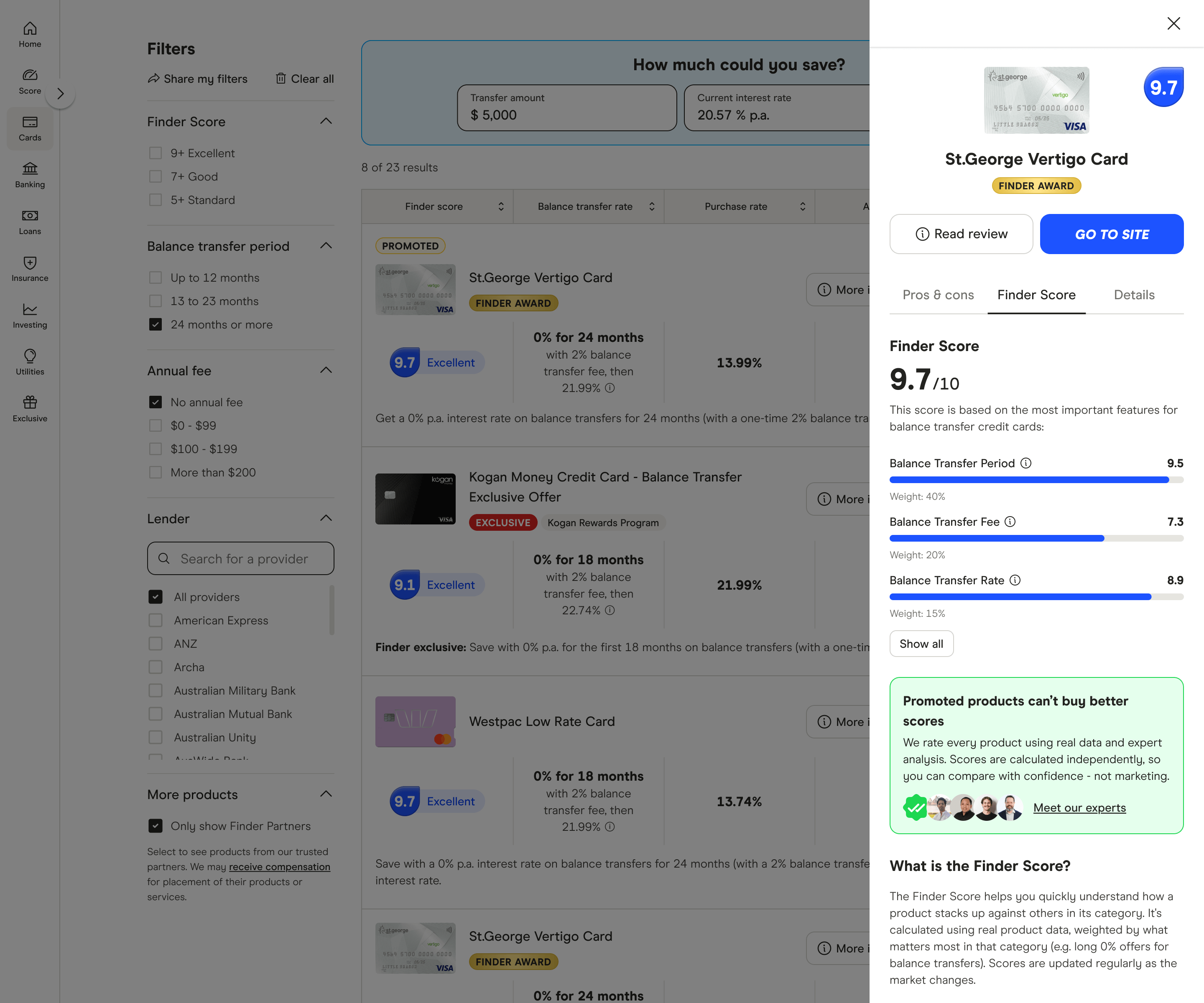
- Finder Score and awards were trusted and helpful - if backed by transparency
- Filtering by speed tier and price was expected and used frequently
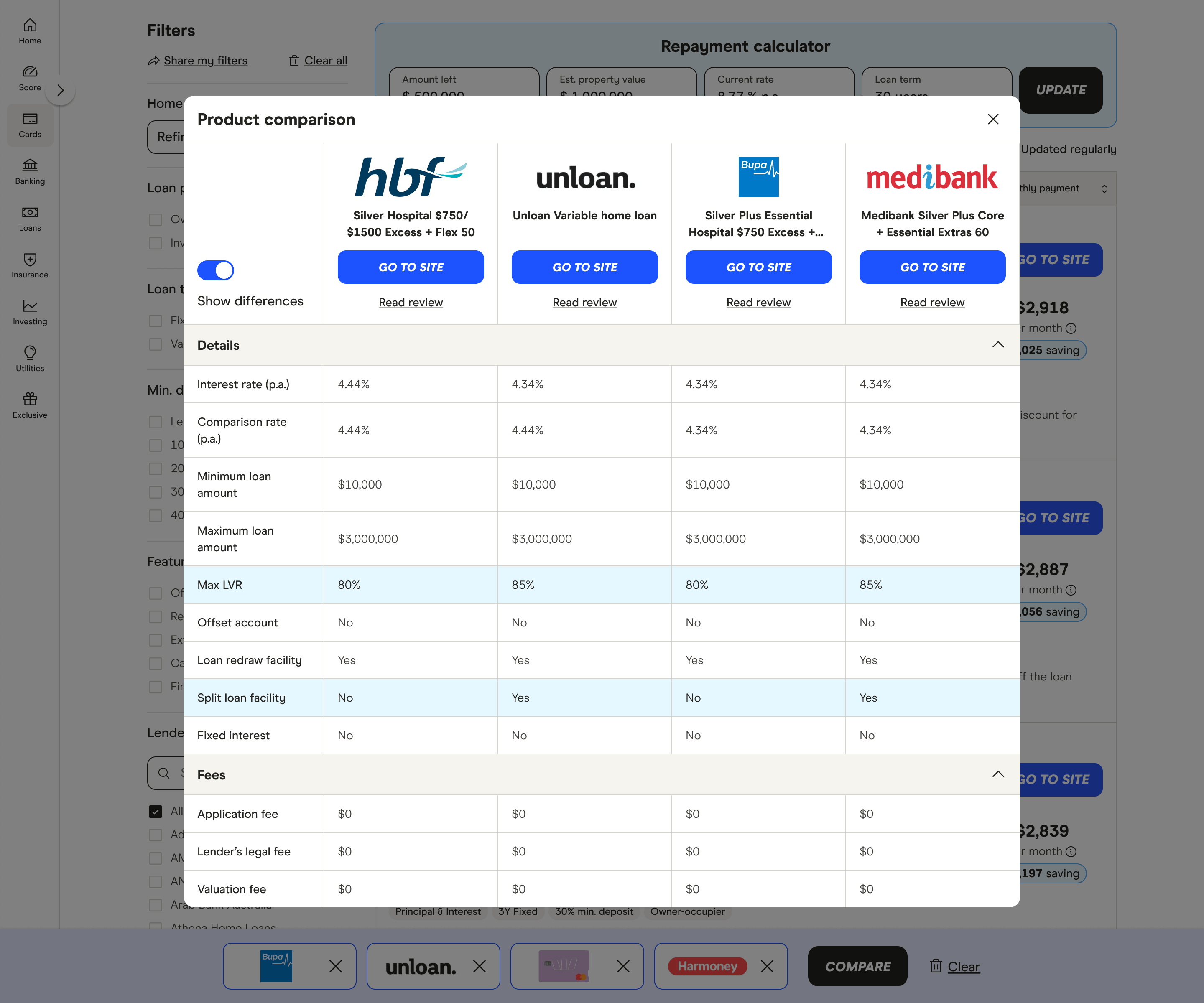
- Compare feature helped some users clarify choices, particularly on desktop
- Trust in Finder as a brand was generally high, especially compared to other comparison sites

Pain points and friction
- Unclear pricing information
- Ineffective or unexpected filter and sort
- Promoted labels perceived as ads
- Mobile UI cluttered, hard to scan and difficult to compare
- "Broadband" unclear
- Limited comparison scope
- Review score lacked explanation
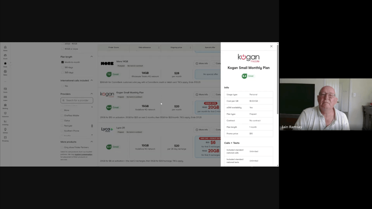
Iterate & experiment
What came next was rapid fire A/B tests to see what numbers we could move. Many failed - but we were learning what not to do.
- Jeremy Cabral - Finder Co-Founder
The result
- Conversion increased between 7% to 26%
- Increased earnings per view
- Client Services could negotiate higher CPC/CPA rates
- Improved UX & UI
- More consistent experience
- Increased engagement metrics
- Scalable components
What I learned
After many failed experiments the solution eventually became clear. I learned what users responded to and better understood their comparison behavior. I learned how powerful some design elements were and how carefully I needed to use them. Results gave me leverage to change minds - especially around designing for the customer rather than business needs.
Not only had I found a winning formula but I also created a "kitchen sink" table component that could work at scale.
A new project was launched off the back of this success - we had six weeks to roll out the successful improvements to create a consistent experience across all major product categories. Challenge accepted 💪