Turning around an underperforming loyalty experiment
Product Design Lead · Nov 2025 – Jan 2026
I took over a failing loyalty program experiment that initially drove a -15% drop in conversion. Through rapid analysis, design optimisation, and iterative split testing, I helped recover performance and ultimately turn the experiment positive within four weeks.
Context
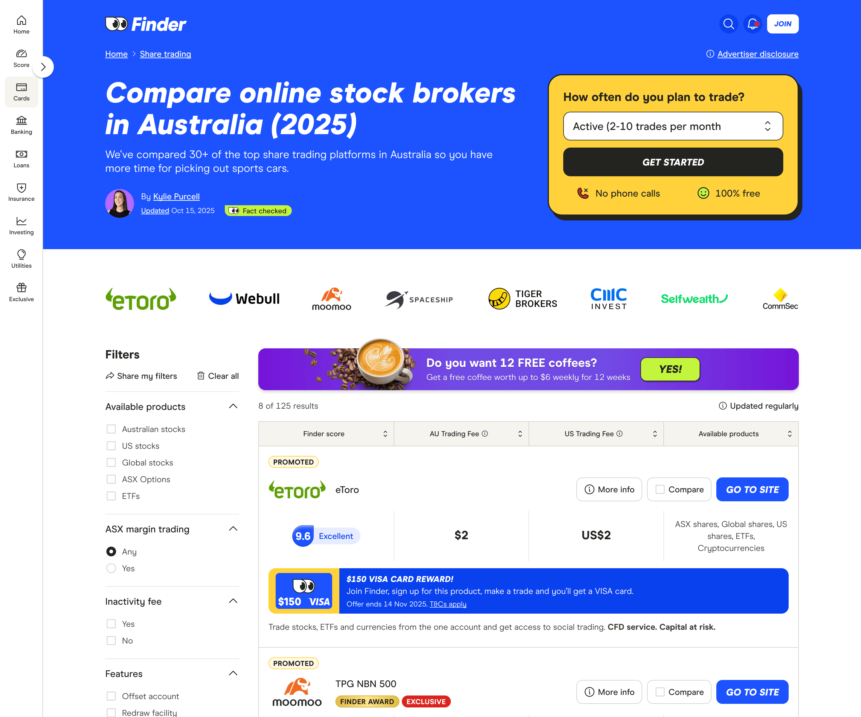
Finder customers typically behave in a transactional way - they arrive via search, compare products, convert once, and leave. One of Finder's key strategic priorities is to increase repeat usage by encouraging customers to return and convert multiple times each year.
To address this, Finder began experimenting with a loyalty program offering customers a free coffee each week for 12 weeks when they sign up for a product. The aim was to encourage repeat visits without negatively impacting conversion rates on key comparison pages.
I took over the project after early experiments significantly underperformed, with the goal of quickly diagnosing the issues and iterating toward a solution that could engage customers while recovering conversion performance under a tight deadline.
Experiment 1: Diagnosing the issue
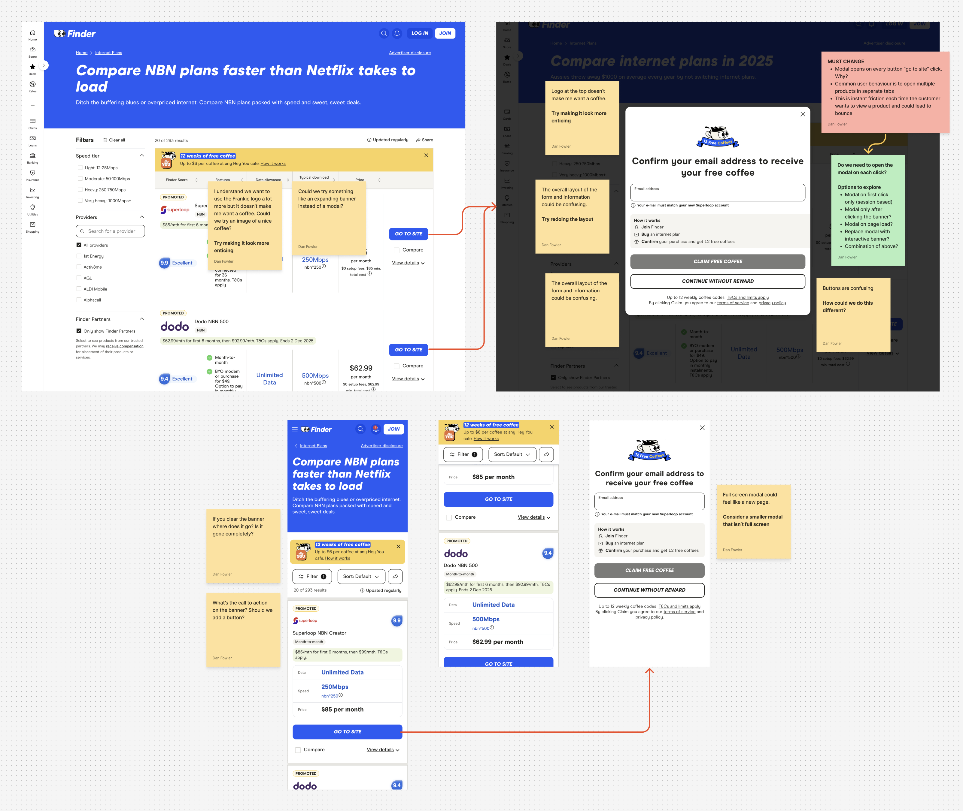
Before making changes, I reviewed the existing designs, experiment data, and page context to understand why the loyalty message was underperforming and how it might be interfering with users' primary goal: choosing and signing up for a product.
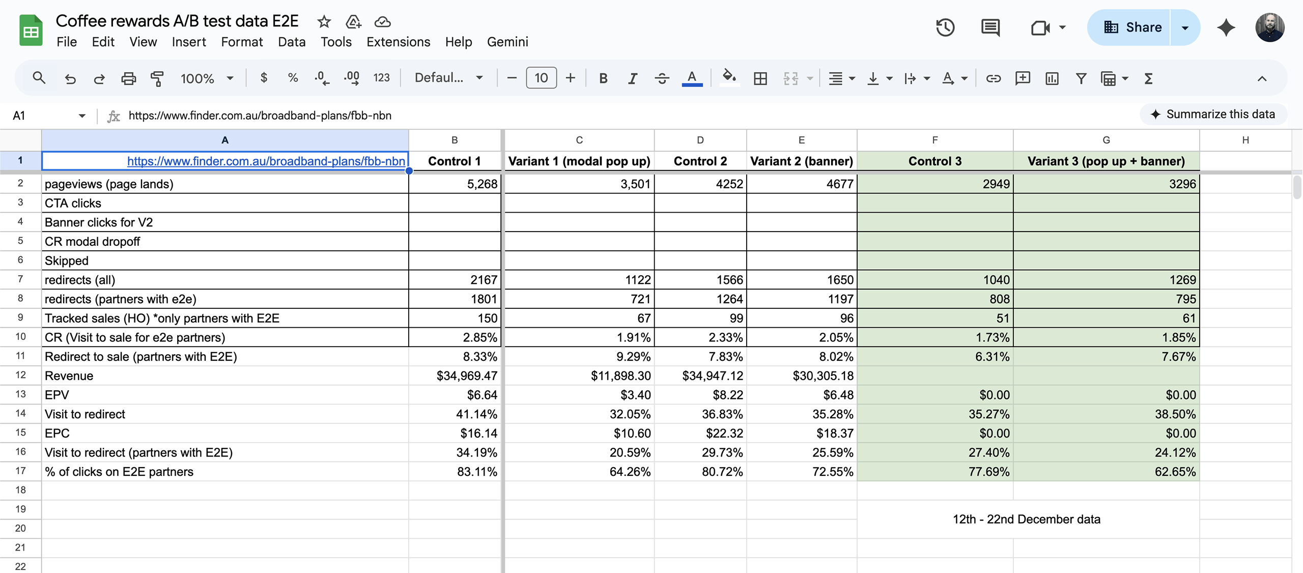
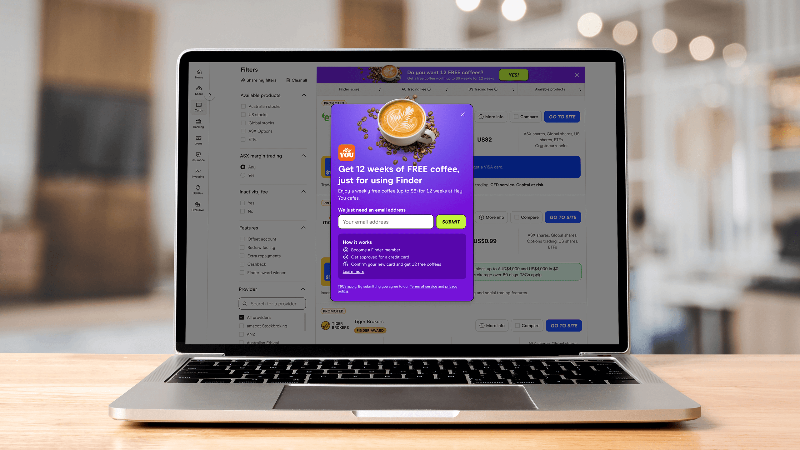
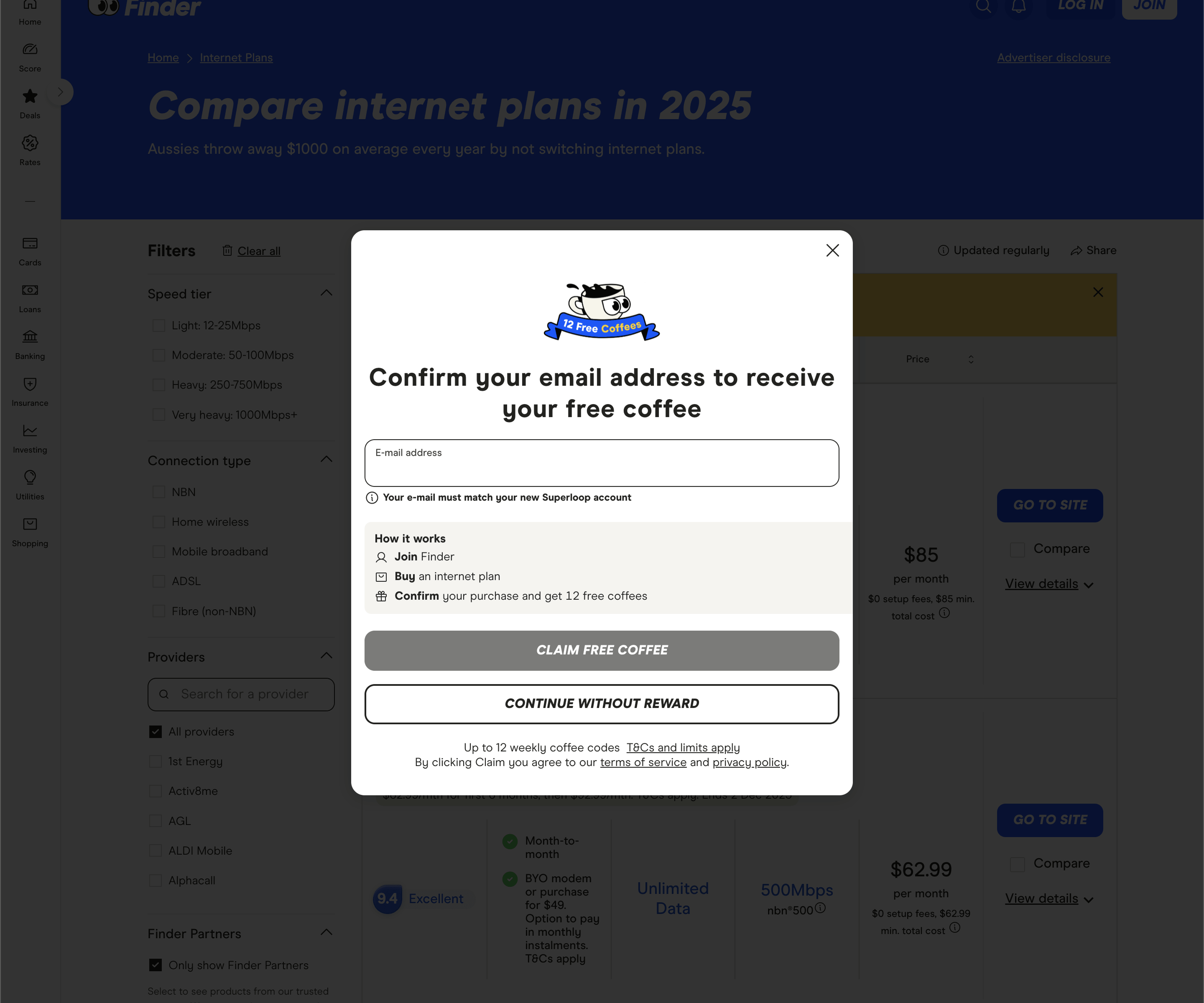
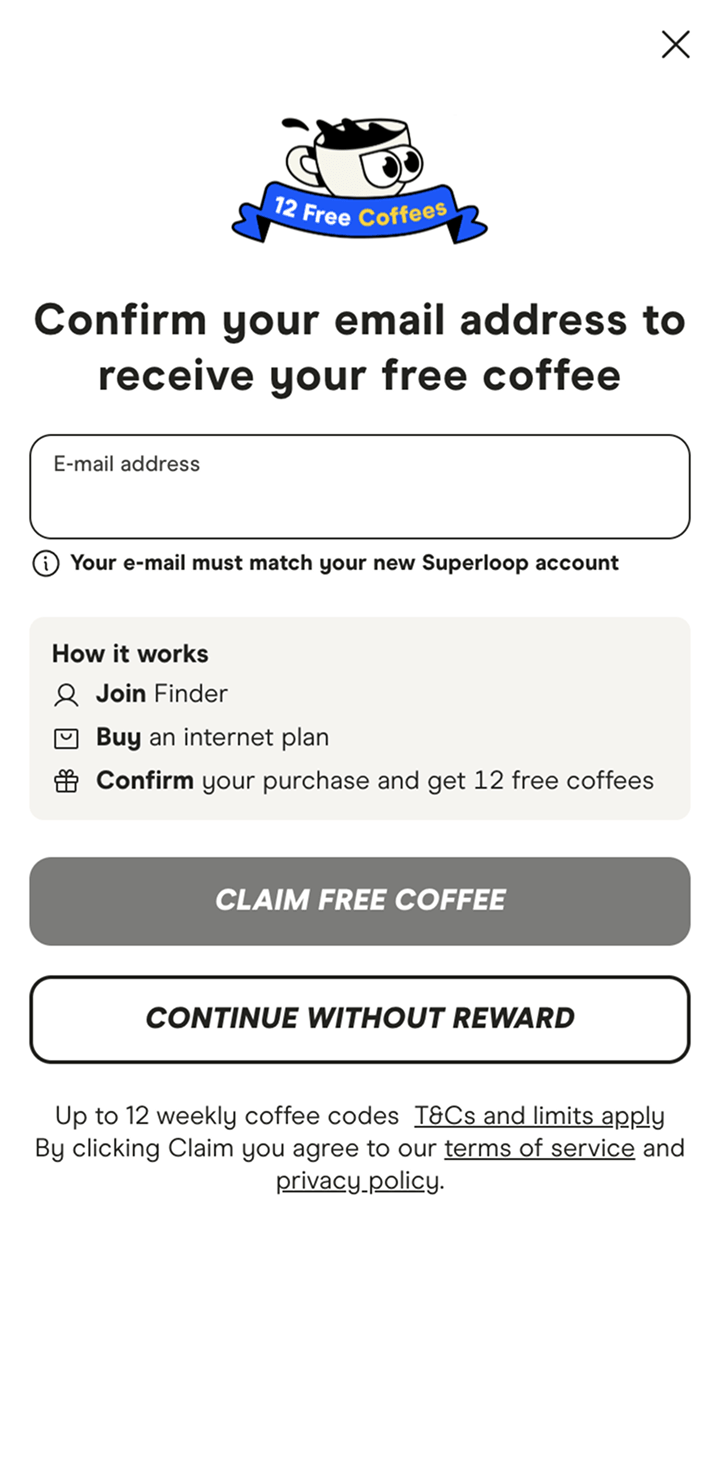
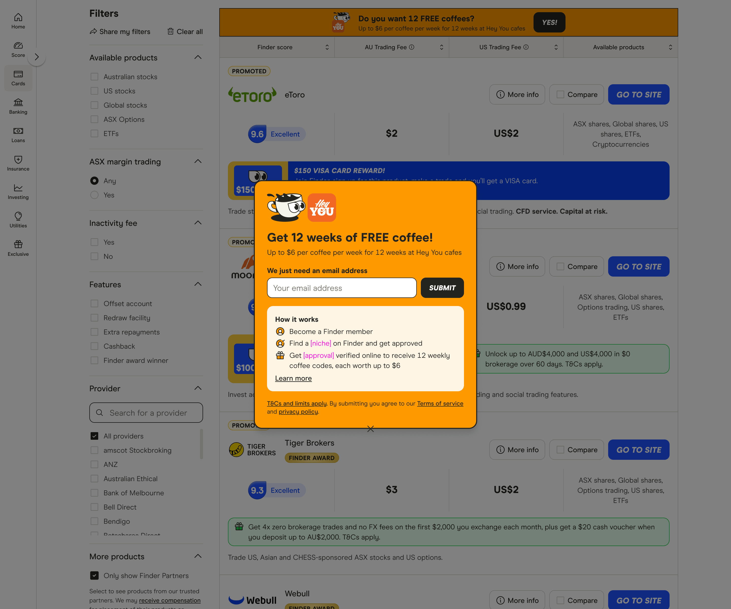
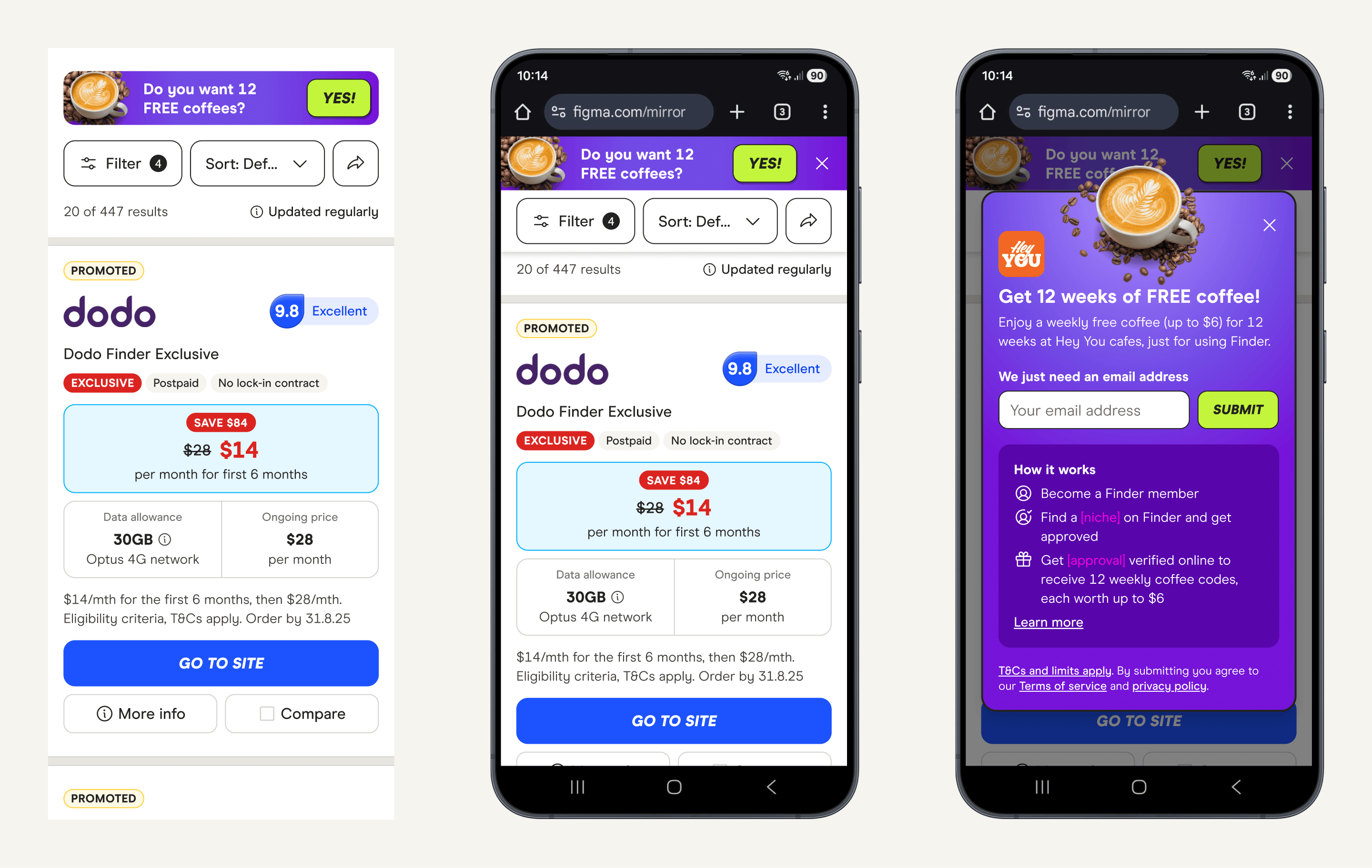
Early results showed that on-page conversion dropped as low as 15% after the loyalty offer went live. Analysis suggested that a key source of friction was the loyalty modal, which interrupted users immediately after clicking a "Go to site" CTA. The modal required an email address and was repeatedly triggered on subsequent CTA interactions, creating an unexpected interruption to the comparison flow and increasing the likelihood of abandonment.
Based on this, I identified two primary problem areas: the disruptive behaviour of the modal and the unclear role of the loyalty banner within the page hierarchy.
Key issues identified
Modal behaviour
- Triggered immediately after CTA interaction, interrupting high-intent moments
- Repeated on every CTA click, increasing friction
- Content layout was dense and difficult to scan
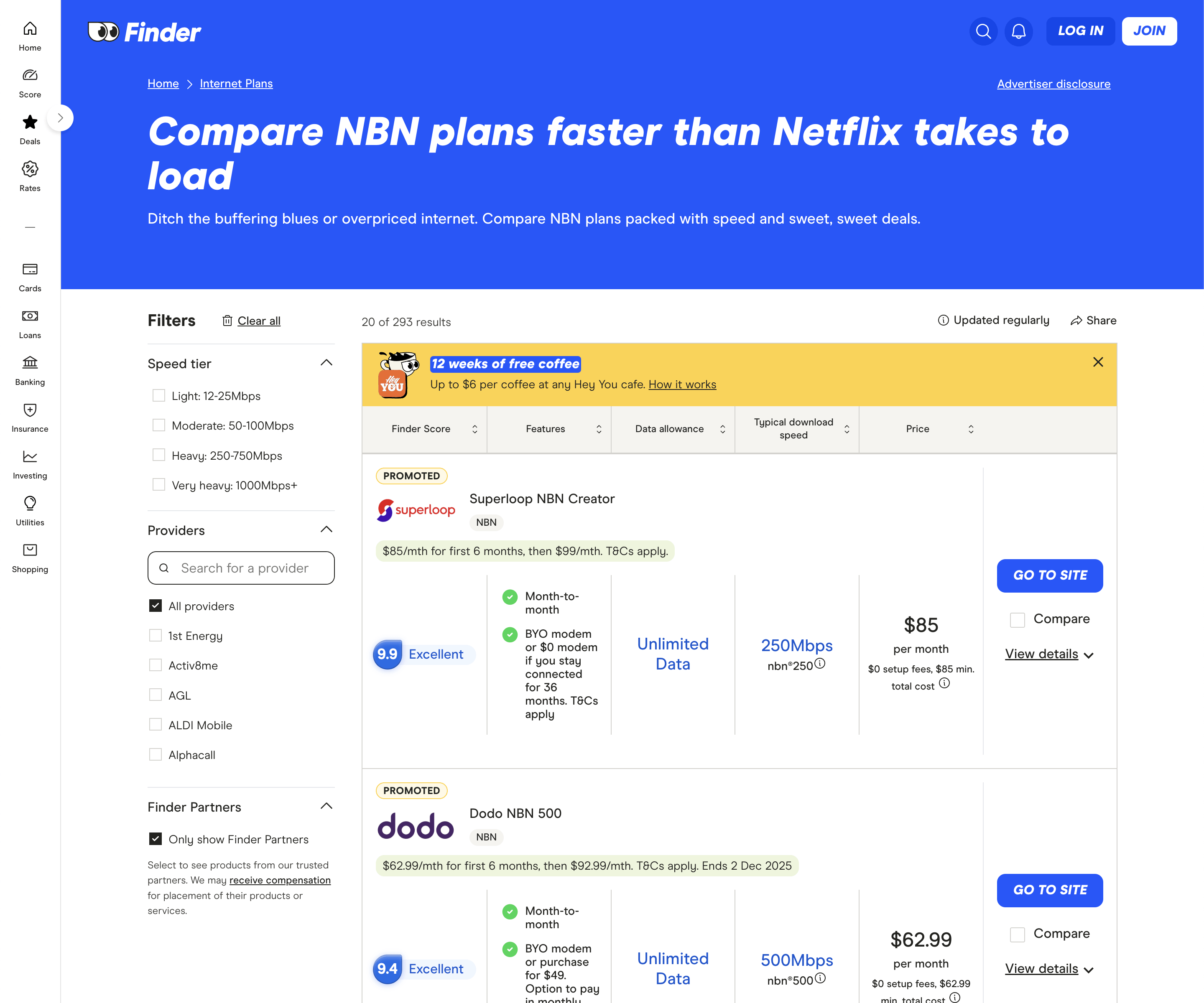
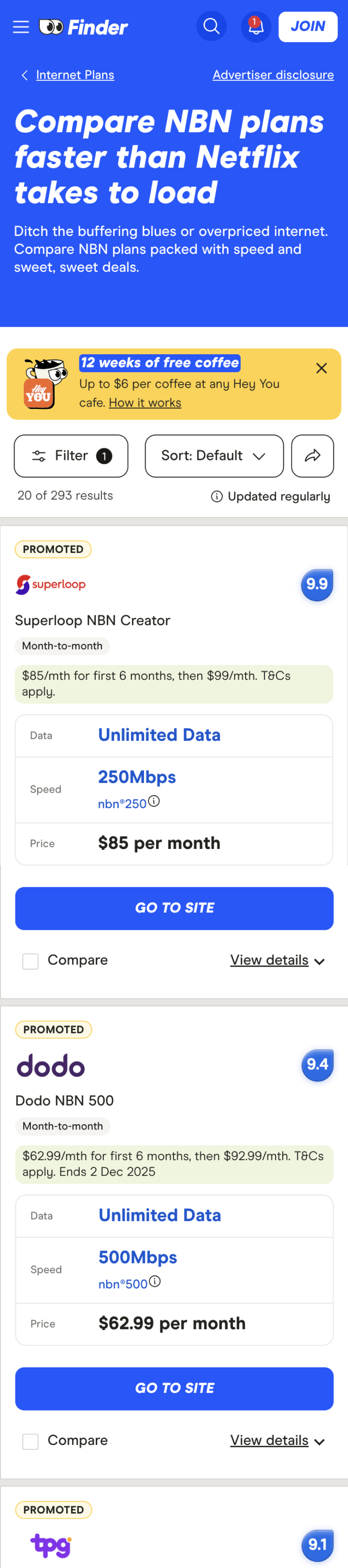
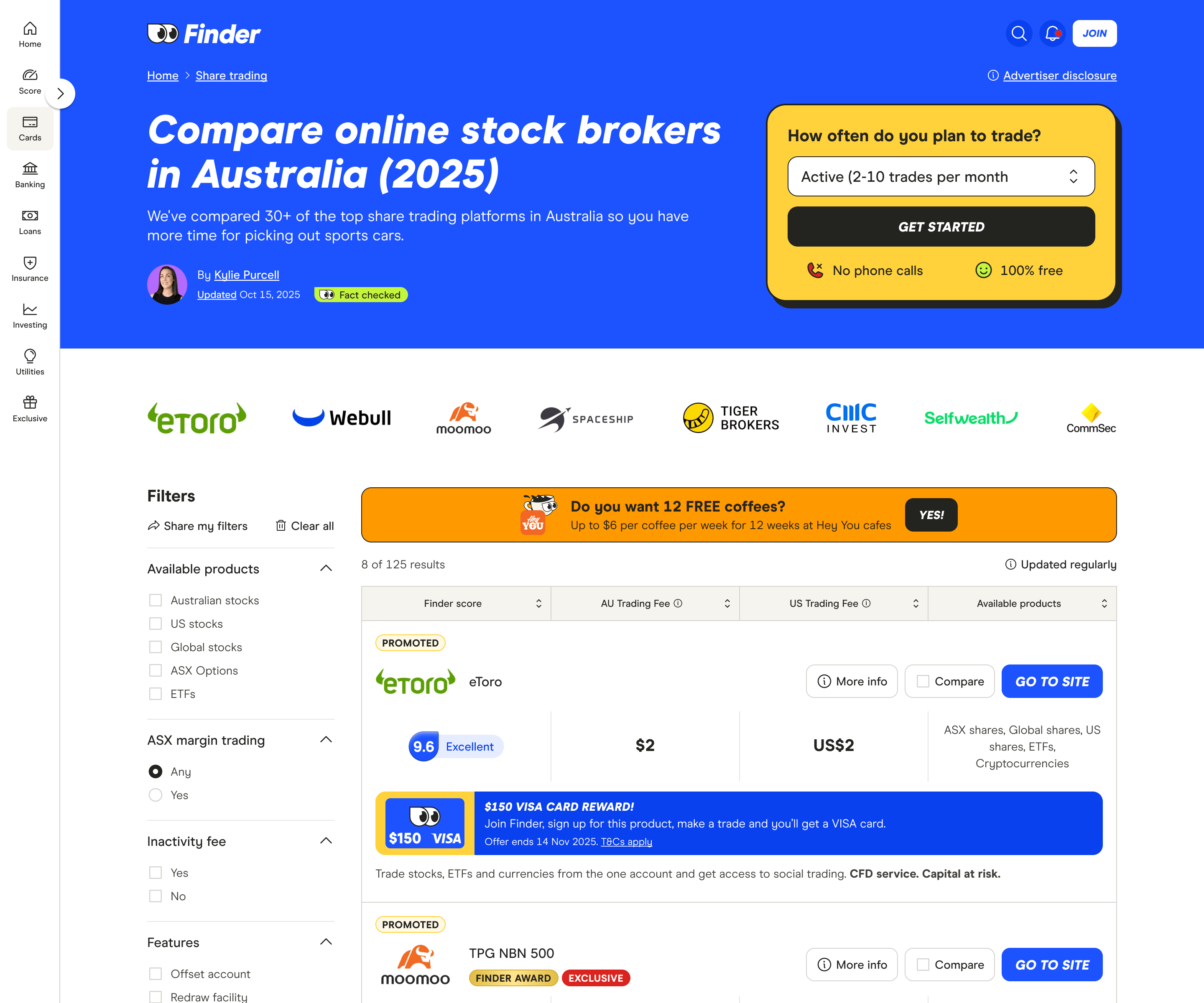
Banner design
- Yellow colour lacked distinction due to overuse elsewhere on the site
- Copy did not clearly invite interaction or explain value
- No clear CTA to intentionally engage with the offer
These insights formed the basis for my first redesign, focused on reducing interruption, restoring hierarchy, and making engagement with the loyalty offer more intentional.
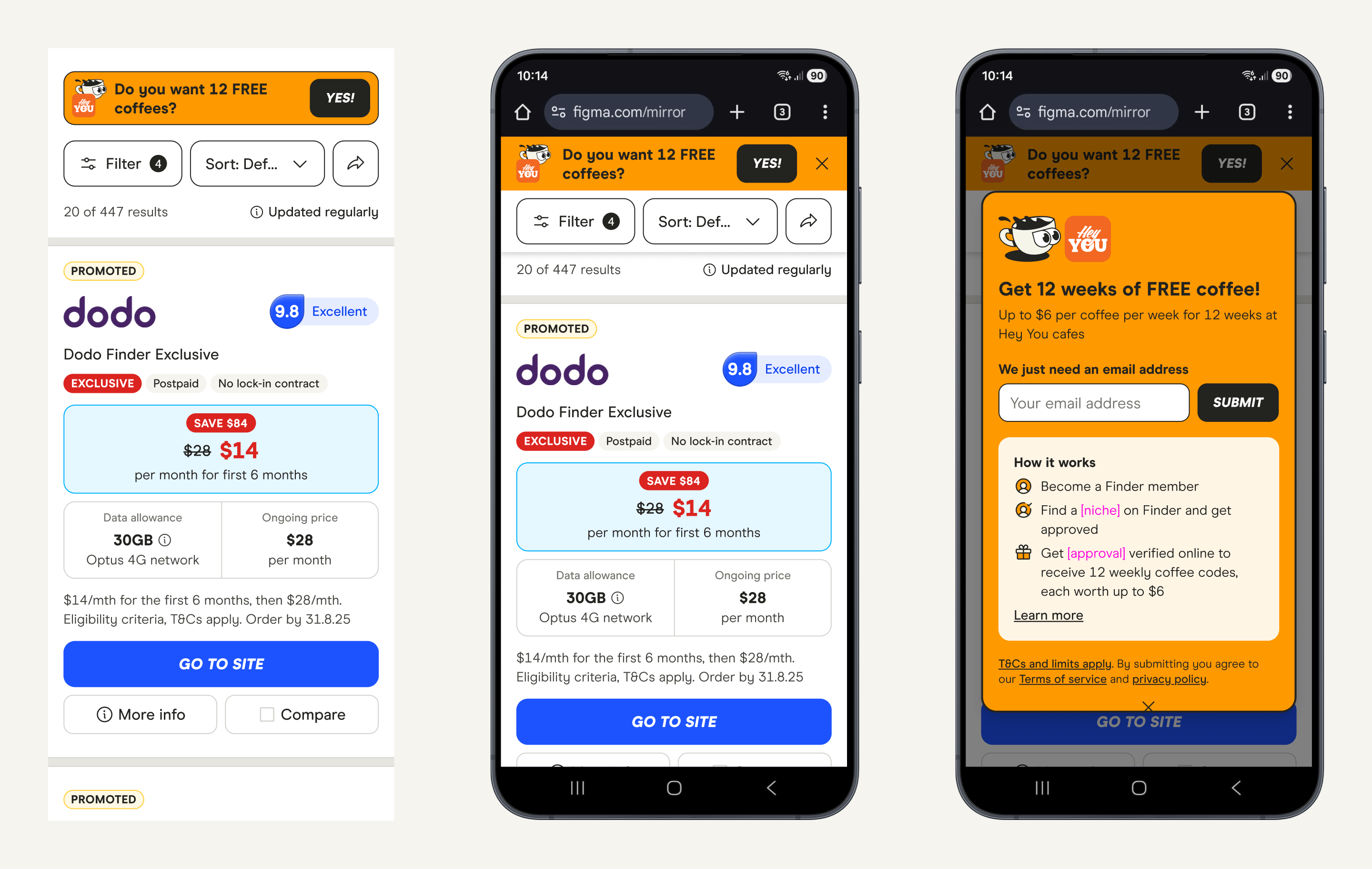
Experiment 2: Reducing friction
With only three days to analyse the first experiment and ship a new iteration, I focused on changes that could be implemented quickly without introducing additional risk. Rather than redesigning the experience entirely, I prioritised copy, functionality, and small visual adjustments aimed at reducing friction and restoring clarity at key decision points.
This experiment was designed to test whether simplifying the loyalty interaction and making engagement more intentional could recover conversion without removing the offer altogether.
Key changes
- Reduced the interruptive behaviour of the loyalty modal
- Clarified copy to better set expectations
- Made interaction with the loyalty offer more deliberate rather than automatic
Result: Conversion improved significantly compared to the first test, but remained slightly negative overall (approximately -8%).
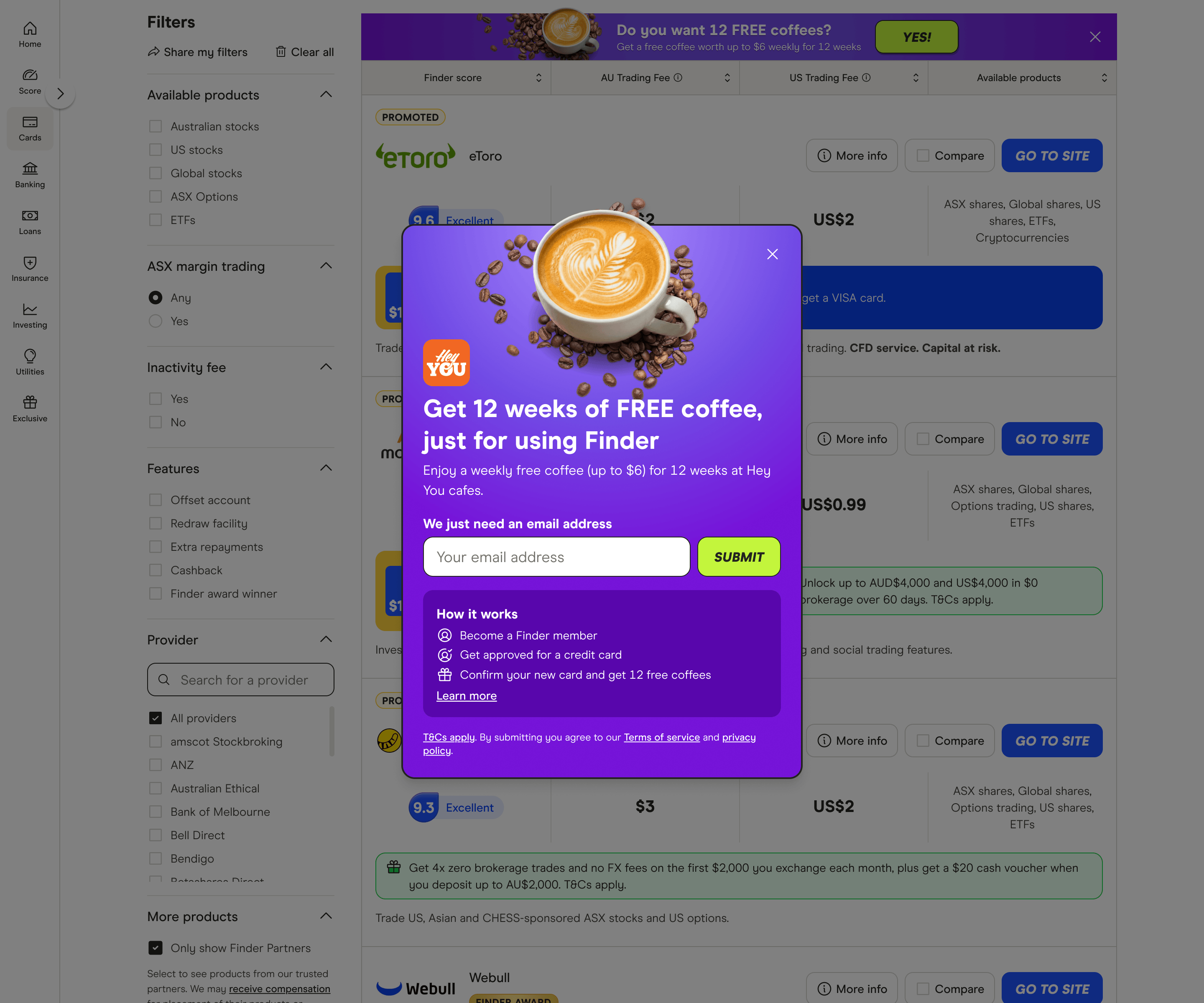
Experiment 3: Refinement and conversion recovery
While Experiment 2 significantly improved performance, conversion remained negative. For the loyalty program to be considered viable, the goal was to achieve neutral or positive conversion without undermining the primary purpose of the comparison pages.
With confidence in the revised flow and messaging, my focus shifted to improving the overall visual appeal and perceived value of the offer. The loyalty treatment lacked desirability, so this iteration aimed to make the reward feel more tangible and enticing - something that clearly communicated value at a glance and felt worth engaging with.
To address low engagement with the offer itself, I also adjusted the trigger behaviour to introduce the loyalty message earlier in the experience, increasing awareness while retaining the improved interaction model from Experiment 2.
Key changes
- Introduced a more appealing colour palette to increase visual distinction
- Added high-quality, appetising imagery to make the reward feel tangible
- Triggered the loyalty modal on page load to improve awareness and engagement
Result: Conversion increased to a positive uplift of approximately +1%.
Results
This project turned a failing loyalty experiment into a positive outcome within a tight timeframe. Over three iterations, conversion recovered from -15% to a positive uplift, validating the loyalty program as a viable way to encourage repeat engagement without compromising core conversion.