Making sense of Finder Rewards
Product Design Lead · Feb 2026 – Apr 2026
Finder Rewards lets members earn cash back when they sign up for eligible products through Finder. The program launched successfully – but the page members used to track their rewards was generating a lot of confusion. This is the redesign.

Context
Finder is a comparison service for financial products – credit cards, home loans, health insurance, NBN and more. When a member clicks through to a partner and signs up, Finder tracks that and rewards the member with cash back as an e-gift voucher.
The program grew quickly but the Rewards page, where members tracked their status and claimed payments, was a first-iteration MVP that wasn't keeping up. Support were fielding the same questions constantly.
The problem
The information was technically on the page, but members weren't understanding it. The support team even had a copy-paste template ready for the most common question.
"People were asking when the status would change to validating. They only see the payment date, but not the eligibility check date. Though this is in the T&Cs, it's not obvious in the rewards hub."
- Real complaint from customer support
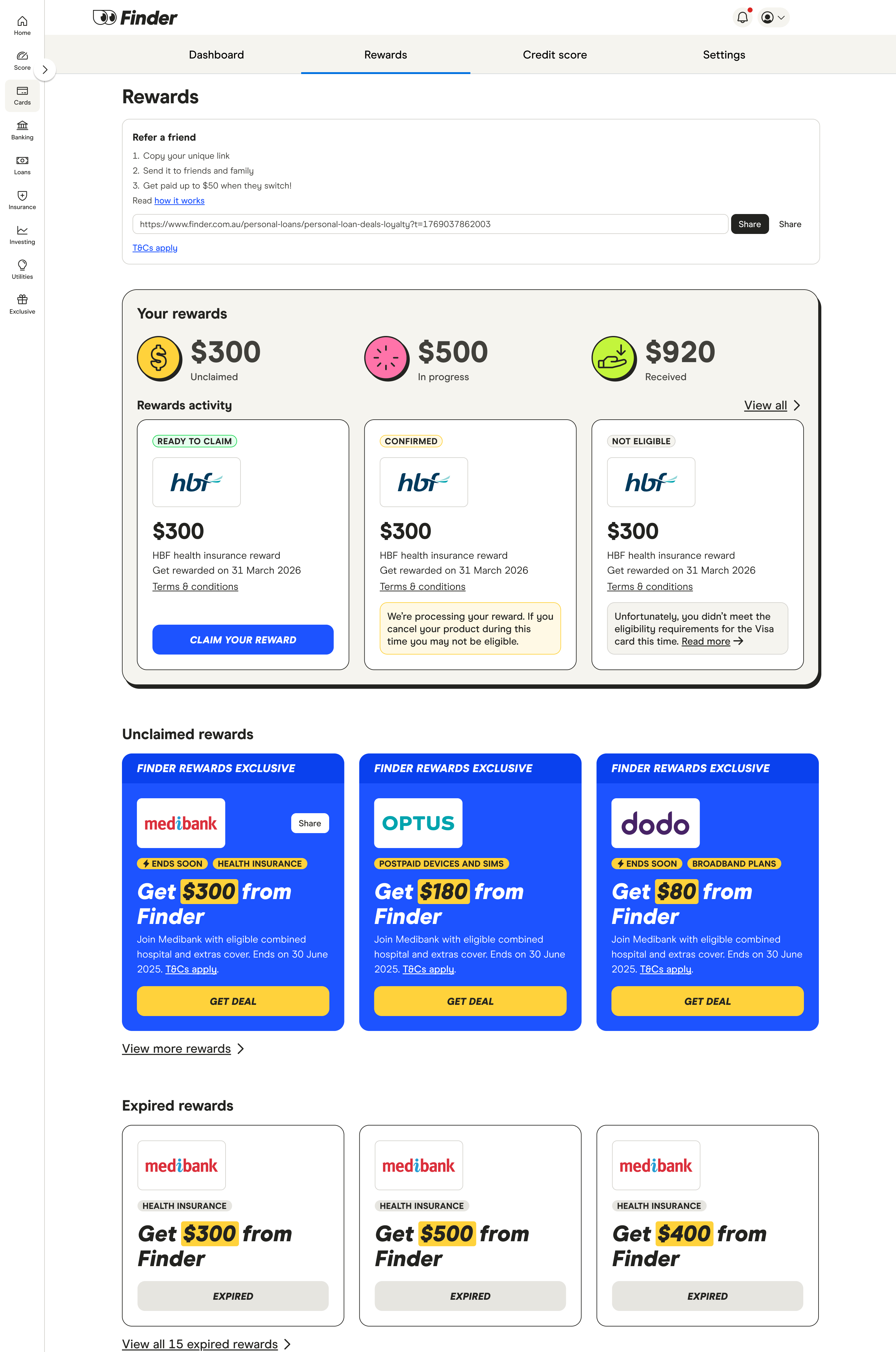
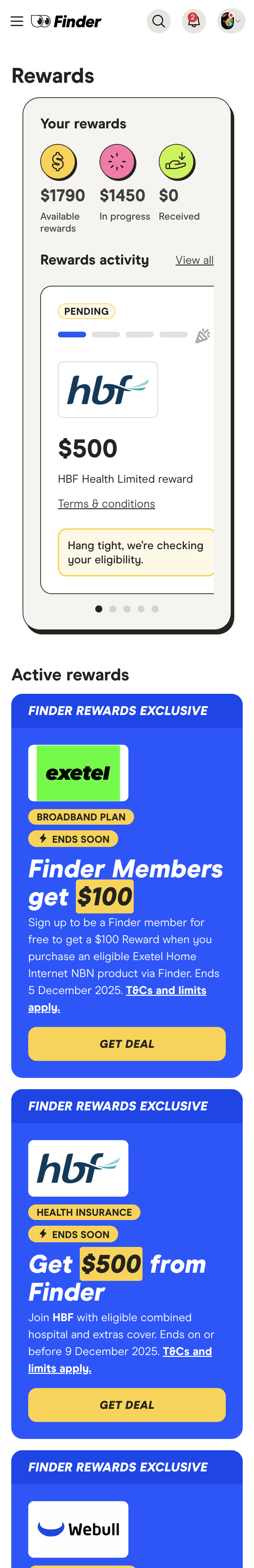
On desktop, rewards activity was a carousel limited to three cards at a time. Status labels like "Tracked Visit" and "Confirmed" had no explanation. Key dates were buried in T&Cs. The refer-a-friend feature had no tracking UI at all. Mobile was scroll-heavy and hard to parse.
"I'm not so sure about Finder and the obscure processes you use to make finding information difficult... I doubt I'd refer or recommend Finder to anyone I cared about."
- Real customer comment, rating: 2/5
The solution
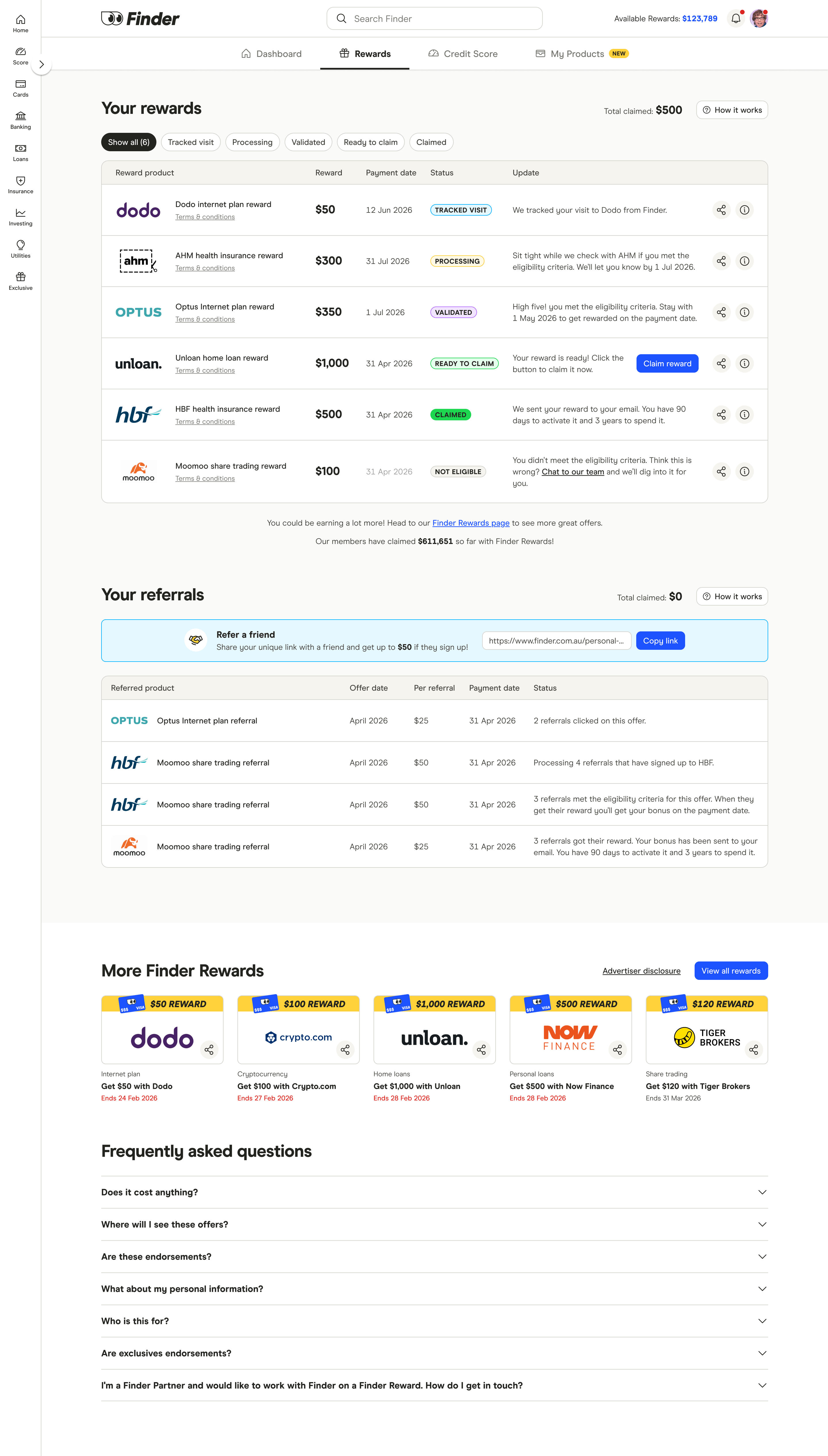
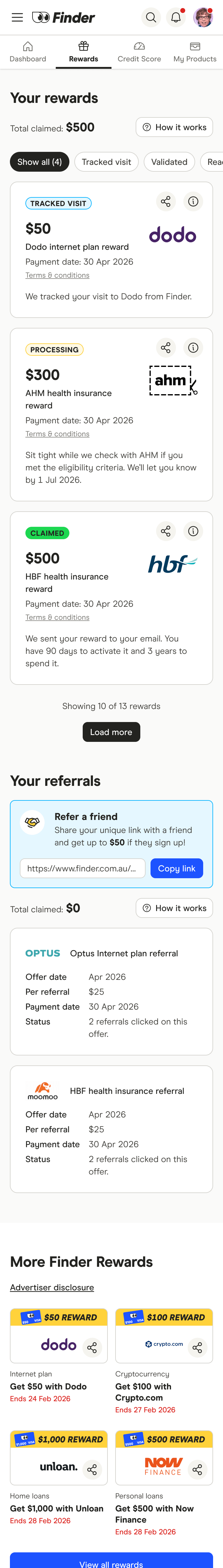
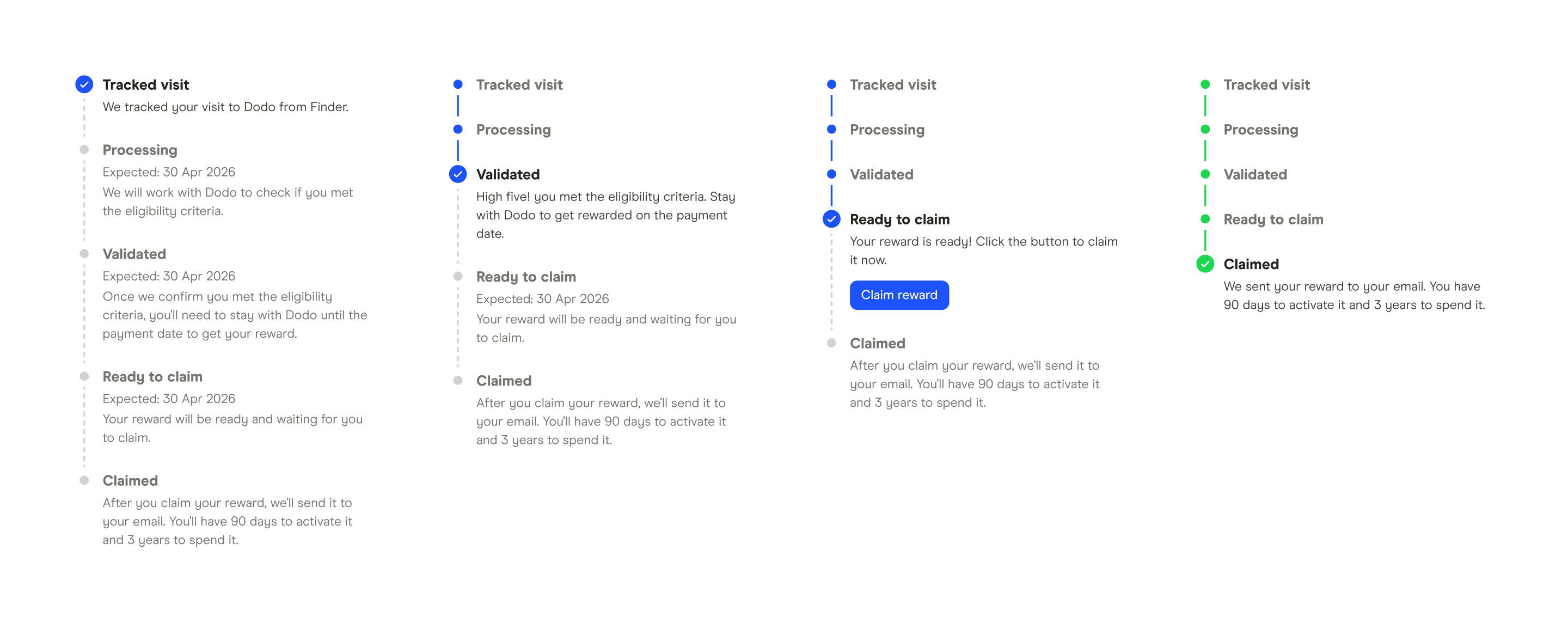
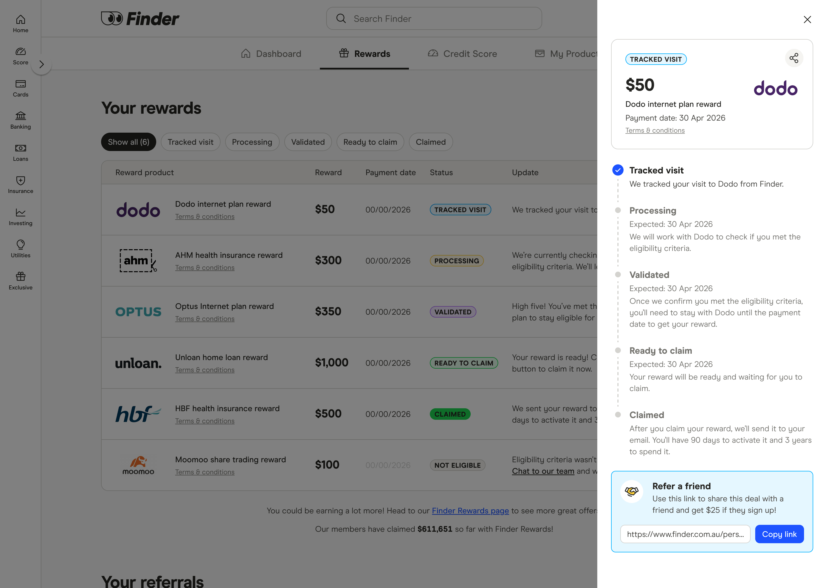
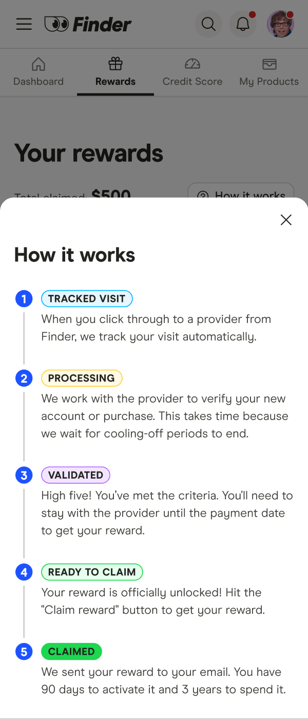
I replaced the carousel with a table – all rewards visible at once, filterable by status. Clicking a row opens a side drawer with a progress stepper showing all five stages of the reward lifecycle, expected dates at each step, and plain-English explanations. The dates question members kept asking about is now answered directly in the UI.
Other changes included
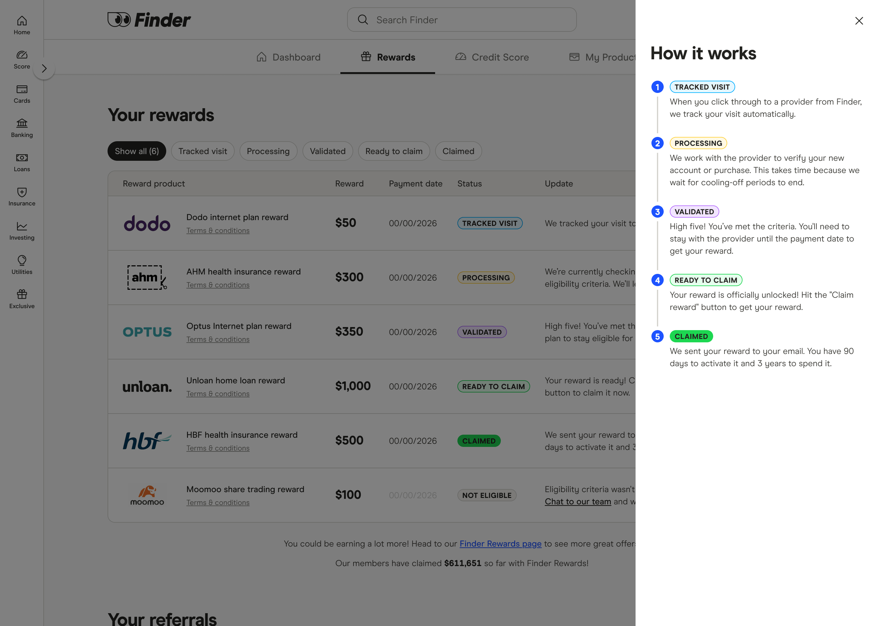
- Two "How it works" drawers – one for rewards, one for referrals, accessible any time without leaving the page
- A new "Your referrals" section with a full tracking table – offer date, per-referral amount, payment date and status
- An FAQ accordion at the bottom to handle the most common support questions in the UI
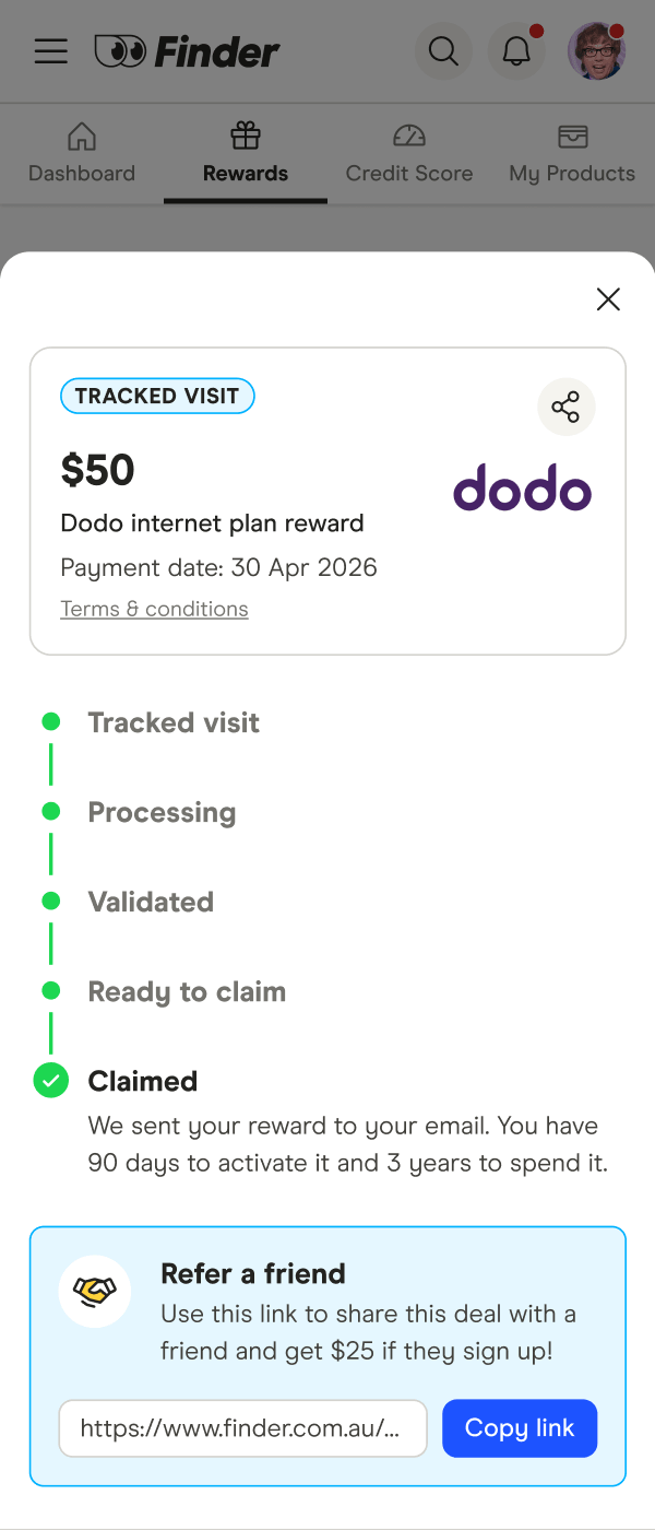
- A full mobile redesign – cards with full status and date info visible, drawers adapted as bottom sheets
Where it landed
The table, filter tabs, referral section, FAQ, and mobile redesign all shipped to production. The drawer interaction was still being built when I left, so I haven't seen it fully live – but the groundwork is there. No post-launch metrics yet, but the problems being solved were well-documented and the design was built to scale as the program grows.